Overview
As of version 2, Pmetrics uses the plotly package
for most plots. Plots made with plotly are interactive, so that moving
your cursor over them results in pop up information being displayed. A
nice feature of plotly is the ggplotly command which takes
any ggplot plot object and turns it into a plotly plot. This
route doesn’t provide complete control of plotly objects, so Pmetrics
uses plotly from the ground up.
However, the documentation for plotly is a bit complex and often lacking in sufficient examples. This vignette attempts to orient you to the specific aspects of plotly most relevant to Pmetrics.
General
Plotly is based on a foundation of lists. Most plot elements are lists whose arguments control characteristics of the elements. Pmetrics chiefly uses only a handful of the elements.
Full descriptions of plotly elements and options to control them can
be accessed by typing plotly::schema() into the R console.
If you have already loaded plotly you can just type
schema(). You will see something like the menu below in the
Viewer tab in Rstudio.
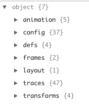
In plotly, the traces items control appearance of the data. The layout items control everything to do with the appearance of the axes and the legend.
Traces
Pmetrics almost exclusively uses scatter traces, and those elements can be referenced by expanding traces ▶ scatter ▶ attributes.
There are many such attributes, but the most commonly used and accessible to the user are line and marker.
Line attributes
All plotly plots in Pmetrics have a line argument which
maps to the line attribute of a plotly scatter trace. When
Pmetrics detects a boolean argument, e.g. TRUE or
FALSE it either plots the default line or suppresses the
line altogether. A good example of this is the line
argument to plot.PM_op to generate an observed
vs. predicted plot. In this function, line is a list of
named lines that can be plotted. If NPex is a
PM_result object loaded with PM_load() then the
default is
NPex$plot$op(line = list(lm = F, loess = T, ref = T)).This
means that a linear model (regression) will not be plotted, a loess
regression will be plotted, and a reference line with slope = 1 and
intercept = 0 will also be plotted. If we are happy with all the
defaults, we simply need to call the plot method for the PM_op
object field in NPex.
NPex$op$plot()Below is a simple example of how to change the default lines plotted,
but retain the default formatting. Now a linear regression (using the R
lm function) is plotted with a reference line, but not a
loess regression.
NPex$op$plot(line = list(lm = T, loess = F, ref = T))The default formats for lines may differ from function to function and are indicated in the help files. However all lines may be formatted using three arguments as a list.
-
colorSpecify the color of the line as a character with either the- name: a good reference in R is to use the
colors()function, e.g. “dodgerblue” - hexadecimal code: this can be searched on the web, and is specified as a character with leading “#” followed by 6 hexidecimal digits, two each for Red, Green, Blue, e.g. “#C0C0C0”. Adding an extra two digits specifies transparency, with 00 fully transparent and FF fully opaque, e.g. #C0C0C066”.
- a plotly function
toRGBwhich takes a color name and alpha (transparency) value on a scale of 0 - 1, e.g.,toRGB("red", 0.5).
- name: a good reference in R is to use the
-
widthUnits are pixels. -
dashSets the dash style of lines. Set to a dash type string (solid,dot, dash, longdash, dashdot, or longdashdot) or a dash length list in px (eg 5px,10px,2px,2px)
Note the default is lm = F and ref = T, so
we don’t need to specify them if that’s what we want.
Marker attributes
All plotly plots in Pmetrics have a marker argument
which maps to the marker attribute of a plotly scatter trace.
When Pmetrics detects a boolean argument, e.g. TRUE or
FALSE it either plots the default marker or suppresses the
marker altogether. A good example of this is also the
marker argument to plot.PM_op to generate an
observed vs. predicted plot. In this function, marker
controls the plotting symbol. If NPex is a PM_result
object loaded with PM_load() then the default is
NPex$plot$op(marker = T).This means that the symbols will
be plotted with default formatting. If we are happy with all the
defaults, we simply need to call the plot method for the PM_op
object field in NPex.
NPex$op$plot()The default formats for markers may differ from function to function and are indicated in the help files. However all markers may be formatted using most commonly four arguments as a list.
-
colorSpecify the color of the marker fill as a character with either the- name: a good reference in R is to use the
colors()function, e.g. “dodgerblue” - hexadecimal code: this can be searched on the web, and is specified as a character with leading “#” followed by 6 hexidecimal digits, two each for Red, Green, Blue, e.g. “#C0C0C0”. Adding an extra two digits specifies transparency, with 00 fully transparent and FF fully opaque, e.g. #C0C0C066”.
- a plotly function
toRGBwhich takes a color name and alpha (transparency) value on a scale of 0 - 1, e.g.,toRGB("red", 0.5).
- name: a good reference in R is to use the
-
sizeUnits are points. -
symbolEither a character name or the numeric value associated with the character. Seeschema()traces ▶ scatter ▶ attributes ▶ marker ▶ symbol ▶ values for all the possibilities, e.g. “circle-open” is equivalent to 100, “square” is equivalent to 1, and “diamond-open-dot” is equivalent to 302. -
opacityOn a scale of 0 (transparent) to 1 (opaque).
Any other marker attribute is possible, including line,
which itself is a list to specify attributes of the outline for a
marker.
Layout
Layout layout ▶ layoutAttributes ▶ displays all the options for the
layout. Pmetrics plot functions currently only provide access to the
following layout options: * legend * xaxis *
yaxis * title Details of how each is accessed
are below.
Legend
In all relevant Pmetrics plotly plots, the argument for legend can
take one of three forms: TRUE, FALSE, or a
list. The first and second options choose to include the default legend
or to suppress the legend, respectively.
Specifying legend as a list allows for detailed
formatting of the legend using any of the attributes documented by
typing schema() into the R console, and expanding layout ▶
layoutAttributes ▶ legend. These can be included as elements in the
legend list.
Here’s a basic legend.
NPex$data$plot(legend = T)…and a more complex one.
X axis and Y axis
Several arguments in most Pmetrics plots map to plotly list elements
that control the formatting of the x- and y-axes. A full list of these
elements can be viewed by typing schema() into the R
console and expanding layout ▶ layoutAttributes ▶ xaxis / yaxis.
-
logWhenTRUE, maps toyaxis = list(type = "log")and sets the y axis to log scale. -
xlimandylimIf specified as vectors of length two, e.g.xlim = c(0, 100), map toxaxis = list(range = xlim)and the same for the y axis. -
xlabandylabIf specified as character vectors of length 1, e.g.xlab = "Time", map toxaxis = list(title = list(text = xlab))and the same for the y axis. However, unlike the simplerlog,xlim, andylimarguments,xlabandylabcan also be specified as lists to control the formatting of the axes labels. The lists follow the plotly conventions:-
textThe name of the axis -
fontThe formatting of the label, itself a list:-
colorColor of the text -
familyThe HTML font family, e.g. “Arial” or “Times New Roman” -
sizeSize in points
-
-
If you only specify a list for xlab it will be applied
to ylab. To format them independently, specify a list for
both.
NPex$data$plot(xlab = "Time (h)", ylab = "Rifapentine (mg/L)")
NPex$data$plot(xlab = list(text = "Time (h)", font = list(color = "slategrey", family = "Times New Roman", size = 18)))
#notice that ylab is also formatted in the same wayFor greater control over the axes, e.g. tick placement, coloring,
etc., the “…” argument in plots is coded to pass arguments to the xaxis
and yaxis lists. This allows access to any attribute. If axis attributes
are passed through … in a named list,
e.g. xaxis = list(linecolor = "red"), then they will be
specific to that axis. However, if the attributes are passed through …
directly, without inclusion in an xaxis or
yaxis list, they will apply to both the axes,
e.g. $plot(...,linecolor = “red”)` will color the xaxis and
yaxis lines red.
NPex$data$plot(xaxis = list(linecolor = "firebrick", ticks = "inside"))
#only affects x axis since formatting within xaxis list
NPex$data$plot(linecolor = "dodgerblue", ticks = "outside")
#formatting affects both axes since arguments are outside xaxis or yaxis listsTitle
All Pmetrics plotly plots have a title argument which
maps to the attributes controlling the text and formatting of the plot
title. A full list of these elements can be viewed by typing
schema() into the R console and expanding layout ▶
layoutAttributes ▶ title. These are the same as for the axes titles,
i.e. text and font, plus additional attributes
to control the positioning of the title. The most common will be
x to control the horizontal placement from 0 (left) to 1
(right) of the plot, and y to control the vertical
placement from 0 (bottom) to 1 (top). The default for x is
0.5 (middle) and for y it is “auto”, which puts the bottom
of the title text onto the vertical center of the top margin.
By default the title text is oriented around the x value
automatically (“auto”) via the xanchor attribute, but this
could also be “left”, “right”, or “center” to make the text begin at,
end at, or span the x value, respectively. Analogous
behavior can be controlled by the yanchor attribute for
which part of the text lines up with the y value: “top”,
“middle”, or “bottom”. The default is “auto”.
NPex$data$plot(title = list(text = "Rifapentine", yanchor = "top"), ylab = "Concentration (mg/L)", xlab = "Time (h)")Shapes
Shapes in plotly are part of the layout and detailed by typing
schema() into the R console and expanding layout ▶
layoutAttributes ▶ shapes ▶ shape. Oddly, there is no native ability in
R plotly to add shapes to an existing plot, so Pmetrics has a custom
function add_shapes which does the job.
The workflow is to first create a plot. All Pmetrics functions return
the plot object so you can either assign the plot call to a variable,
e.g. p <- plot(...) or use the current plot via plotly’s
last_plot function, which is the default value for
add_shapes.
Since reference lines are by far the most common shape to add,
Pmetrics has a helper function called ab_line, which is
very similar to the workflow in base R that uses the abline
function to add a line to the current plot.
NPex$data$plot() %>%
  add_shapes(ab_line(h = 5, line = list(color = "green", width = 3)))
Note the use of the pipe operator %>% to pipe the
plot directly into the add_shapes function. This is not
mandatory, since add_shapes by default takes the current
plot as its target. If you have a previously saved plot in a variable,
you can add a shape any time by supplying that variable to
add_shapes, for example
add_shapes(p, ab_line(h = 5)).
It is possible to add other shapes, but it will require more manual effort as there are no Pmetrics helper functions to add circles, rectangles, or paths. Here’s an example of adding a circle.
NPex$data$plot() %>%
  add_shapes(shape = list(type = "circle", x0 = 122, x1 = 132,
                                y0 = 15, y1 = 22))
The values for x0 and x1 determine the left and right extent, and for
y0 and y1 the bottom and top of the circle. Coordinates are absolute,
unless you include xref = "paper" and/or
yref = "paper" An additional line list can control
formatting.
Annotations
Here plotly does provide two functions to add annotations to plots as labels or as floating text.
plotly::add_annotations() will add labels to data,
allowing for connection between the data point and the label by an
arrow. The options are detailed by typing ?add_annotations
into the R console. However, rather than following the hyperlink there
to get additional information on options, you can get more help by
typing schema() into the R console and expanding layout ▶
layoutAttributes ▶ annotations ▶ items ▶annotation.
Similarly, plotly::add_text() adds labels/text to a
plot, but without the connecting line. The options are detailed by
typing ?add_text into the R console. You can get more
options by typing schema() into the R console and expanding
traces ▶ scatter ▶ attributes ▶ text, textfont, and textposition. The
others (textpositionsrc, textsrc, texttemplate, textemplatesrc) are more
obscure and not needed.
Annotations with connecting arrows…
NPex$data$plot() %>%
  add_annotations(text = ~id) #the tilde tells plotly to use the contents of the id column
Text without arrows…
NPex$data$plot() %>%
  add_text(text = ~id, textposition = "top right",
           textfont = list(color = "green", size = 12))
A single text item…
NPex$data$plot() %>%
  add_text(x = 125, y = 2, text = "<b>Limit of quantification</b>", textfont = list(size = 10)) %>%
  add_shapes(shape = ab_line(h = 1.8))
Notice how the tidyverse pipe %>% lets you string
together commands. Tidyverse is
a powerful set of libraries for R that permit methodical, advanced data
manipulation. You can load it with library(tidyverse). In
the plot below, we return to add_annotations to demonstrate
that it gives you more control over the formatting. Generally, this
function is likely the more useful to add text pop ups or to label data.
Notice the use of the html tags to surround the text and make it
bold. You can also use <i></i> for italics, but
plotly does not support <u></u> for
underline.
NPex$data$plot() %>%
  add_annotations(x = 125, y = 2, text = "<i>Limit of quantification</i>", font = list(size = 10), showarrow = F, bgcolor = "antiquewhite", bordercolor = "black") %>%
  add_shapes(shape = ab_line(h = 1.8))
Exporting
Images
Although the plotly team is working on methods to export plots to
images via scripting, they require installation of additional components
=. So Pmetrics includes a wrapper function export_plotly()
which you can use to install the necessary components and export
images.
Exporting a plotly plot to a static image can be accomplished in two additional ways.
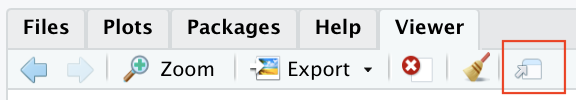
The first is to select the Export button from the Viewer window in Rstudio when the desired plot is displayed. This gives the option to save the plot as a .png, .jpeg, or .tiff. You cannot save as a .pdf with this method.

The second option is to click the camera icon that appears in the top right of a plotly plot when you mouse over the plot.

This gives you the option to download and save the file as a .png.
PDFs
To export to a .pdf, you can also use export_plotly() in
Pmetrics. You can also open the plot in a browser.
From there you should be able to export the image as .pdf file.