This is largely now a legacy plotting function, replaced by plot.PM_sim. Plots PMsim objects with the option to perform a visual and numerical predictive check
Usage
# S3 method for PMsim
plot(
  x,
  mult = 1,
  log = TRUE,
  probs = c(0.05, 0.25, 0.5, 0.75, 0.95),
  binSize = 0,
  outeq = 1,
  pch = NA,
  join = TRUE,
  x.qlab = 0.4,
  cex.qlab = 0.8,
  pos.qlab = 1,
  ci = 0.95,
  cex.lab = 1.2,
  xlab = "Time (h)",
  ylab = "Output",
  xlim,
  ylim,
  obs,
  grid,
  ocol = "blue",
  add = FALSE,
  out = NA,
  ...
)
Arguments
- x
The name of an PMsim data object generated by
SIMparse- mult
Multiplication factor for y axis, e.g. to convert mg/L to ng/mL
- log
Boolean operator to plot in log-log space; the default is
False- probs
Vector of quantiles to plot; if set to
NA, all simulated profiles will be plotted, and numerical predictive checking will be suppressed- binSize
Width of binning interval for simulated concentrations, in time units, e.g. hours. For example, a
binSizeof 0.5 will pull all simulated concentrations +/- 0.5 hours into the same time. This is useful for plotting PMsim objects made duringmake_valid. The default is 0, i.e. no binning.- outeq
Which output equation to plot if more than 1
- pch
Controls the plotting symbol for observations; default is NA which results in no symbol. Use 0 for open square, 1 for open circle, 2 for open triangle, 3 for cross, 4 for X, or 5 for a diamond. Other alternatives are “*” for asterisks, “.” for tiny dots, or “+” for a smaller, bolder cross. These plotting symbols are standard for R (see
par).- join
Boolean operator to join observations by a straight line; the default is
True.- x.qlab
Proportionate value of x-axis at which to draw the quantile labels; 0 is left, 1 is right. The default is 0.4.
- cex.qlab
Size of the quantile labels.
- pos.qlab
This allows more refined positioning of the quantile labels. It takes standard R values: 1, below; 2, left; 3, above; 4, right.
- ci
Width of confidence interval bands around simulated quantiles, from 0 to 1. If 0, or nsim<100, will not plot. Default is 0.95, i.e. 95th percentile with tails of 2.5 percent above and below excluded.
- cex.lab
Size of the plot labels.
- xlab
Label for x-axis; default is “Time”
- ylab
Label for y-axis; default is “Output”
- xlim
Limits of the x-axis as a vector, e.g.
c(0,1). It does not need to be specified, but can be.- ylim
Analogous to
xlim- obs
The name of an makeOP data object generated by
makeOP. If specified, the observations will be overlaid upon the simulation plot enabling a visual predicitve check. In this case, a list object will be returned with two items: $npc containing the quantiles and probability that the observations are below each quantile (binomial test); and $simsum, the times of each observation and the value of the simulated quantile with upper and lower confidence intervals at that time.- grid
Either a boolean operator to plot a reference grid, or a list with elements x and y, each of which is a vector specifying the native coordinates to plot grid lines; the default is
False. For example, grid=list(x=seq(0,24,2),y=1:10). Defaults for missing x or y will be calculated byaxTicks.- ocol
Color for observations
- add
Boolean operator, if
Truewill add lines to existing plot- out
Direct output to a PDF, EPS or image file. Format is a named list whose first argument,
typeis one of the following character vectors: “pdf”, “eps” (maps topostscript), “png”, “tiff”, “jpeg”, or “bmp”. Other named items in the list are the arguments to each graphic device. PDF and EPS are vector images acceptable to most journals in a very small file size, with scalable (i.e. infinite) resolution. The others are raster images which may be very large files at publication quality dots per inch (DPI), e.g. 800 or 1200. Default value isNAwhich means the output will go to the current graphic device (usually the monitor). For example, to output an eps file, out=list(“eps”) will generate a 7x7 inch (default) graphic.- ...
Other parameters as found in
plot.default.
Value
Plots the simulation object. If obs is included, a list will be returned with
the folowing items:
- npc
A dataframe with three columns: quantile, prop.less, pval. quantile are those specified by the
probargument to the plot call; prop.less are the proportion of simulated observations at all times less than the quantile; pval is the P-value of the difference in the prop.less and quantile by the beta-binomial test.- simsum
A dataframe with the quantile concentration at each simulated time, with lower and upper confidence intervals
- obs
A dataframe similar to an PMop object made by
makeOPwith the addition of the quantile for each observation
Details
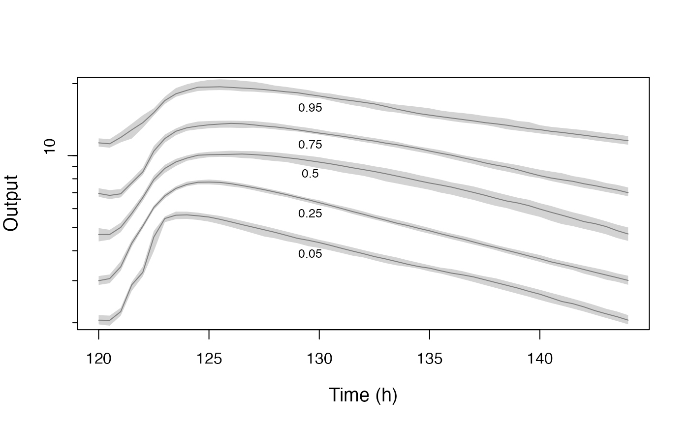
Simulated observations are plotted as quantiles on the y-axis vs. time on the x.axis. If measured observations are included, a visual and numerical predictive check will be performed.
Examples
library(PmetricsData)
plot(simEx$data[[1]])

