run1 <- PM_load(1, path = "Runs")9 Examine results
Recall that in the previous exercises, we loaded our run results with the following.
run1 is now a PM_result R6 object that contains all the results from the NPAG run. Let’s dig into it in more detail.
9.1 Objects within a PM_result
9.1.1 Data
9.1.1.1 Data plots
You can plot the original data using R6 with various options. Type ?plot.PM_data in the R console for help.
run1$data$plot() Here’s some nice grouping and coloring. If you use grouping, provide names in group_names and colors/symbols for each group as arguments to marker. Colors of lines will be set to the same as for marker to avoid a mess of colors.
run1$data$plot(group = "gender", group_names = c("Female", "Male"),
  marker = list(color = c("red","blue"), symbol = c("circle","triangle-up")))
The next one splits the data by subject but will not render easily in this document. You can interact with it in your own script or Quarto document.
run1$data$plot(overlay = FALSE, xlim = c(119, 145))The following are the older S3 method with plot(...) for the first two examples. You can use R6 or S3 for any Pmetrics object. We will focus on R6 as the more modern way.
plot(run1$data)If you would like to plot the observations and posterior predictions made at idelta intervals (see options for $fit method in PM_model , you can do that by adding a pred line to a data plot. See plot.PM_data for more information.
# suppress the segments joining observations and add posterior predictions with `pred = "post"`
run1$data$plot(line = list(join = FALSE, pred = "post"), xlim = c(119, 145))
Typically you would want to use overlay = FALSE with the above to avoid a mess of lines joining observations and predictions from different subjects, but it will not render easily in this document. You can interact with it in your own script or Quarto document.
9.1.2 Observed vs. Predicted (OP)
9.1.2.1 OP plots
You can plot observed vs. predicted data. Type ?plot.PM_op in the R console for help or check out plot.PM_op.
run1$op$plot() Below, you can see how to change the prediction type, regression line and color, and plotting symbol and color. Most plots in Pmetrics have marker and line list arguments to customize the appearance of the plotting symbols and lines.
run1$op$plot(pred.type = "pop")
run1$op$plot(line = list(lm = FALSE, loess = list(color = "red")), marker = list(symbol = 3, color = "green"))
9.1.2.2 OP summaries
Get a summary with bias and imprecision of the population predictions; ?summary.PM_op in the console or summary.PM_op for more information. The default pred.type is “post”, which are the predictions based on the full Bayesian posterior distribution of parameter values for an individual. The predictions are the weighted mean or median (controlled by the icen argument in all Pmetrics functions) of the predictions from each support point in the individual’s Bayesian posterior, joint probability parameter distribution, i.e. the support points in the posterior. Here we will look at the population predictions based on the means of the parameter values.
run1$op$summary(pred.type = "pop", icen = "mean")The nicely formatted table below will open in your Viewer panel giving you the summary statistics for non-missing observations and corresponding predictions.
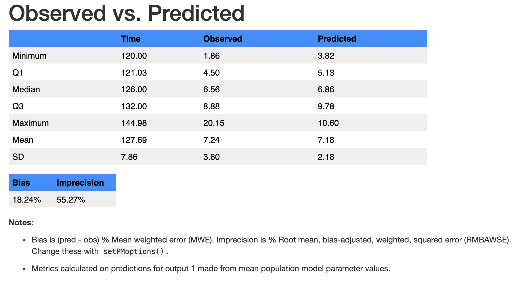
Notes at the bottom of the table tell you the basis for the predictions, which can be changed with arguments to the $summary() method, which calls summary.PM_op. For example, aince neither “pop” nor “mean” are the defaults, we have to specify them. We can also use the S3 method for the same summary below.
summary(run1$op, pred.type = "pop", icen = "mean") # S3 methodAs with any object in Pmetrics, the PM_op R6 object has fields and methods. As a reminder of what we’ve covered in several previous chapters, R6 fields contain data and methods are functions that act on the data. All fields and methods are accessed with $ added to the name of the object. For example, in a PM_op object and most other Pmetrics objects, the raw data can be accessed via the $data field.
run1$op$dataHaving the raw data provides a data frame compatible with any R function, particularly those from Tidyverse, including piping (|>). If you’re not familiar with the pipe operator, see this article. We strongly recommend Tidvyerse for data manipulation and visualization in R, and Pmetrics works well with it. See R for Data Science for more information.
This allows pre-processing in ways more flexible than the default plot method.
library(tidyverse)
run1$op$data |> plot()
run1$op$data |>
  filter(pred > 5) |>
  filter(pred < 10) |>
  summary()
See a header with the first 10 rows of the op object:
head(run1$op$data, 10)9.1.3 Final population joint density
9.1.3.1 Final plots
Plot the final population joint density. Type ?plot.PM_final in the R console for help.
run1$final$plot()

# alternate methods with same result
run1$final$data |> plot() # tidyverse style
plot(run1$final) # S3 method
plot(run1$final$data) # S3 method
You can add a kernel density curve.
run1$final$plot(line = list(color = "red"))It is possible to make a bivariate plot. Plotting formulae in R are of the form y~x
run1$final$plot(ke ~ v,
  marker = list(color = "red", symbol = "diamond"))
9.1.3.2 Final summaries
See a summary with confidence intervals around the medians and the Median Absolute Weighted Difference (MAWD); ?summary.PM_final for help and further explanation.
run1$final$summary()The original final object can be accessed with the $data field.
run1$final$data
names(run1$final$data)
See the population points:
run1$final$popPoints
#> # A tibble: 17 × 5
#>       ka     ke     v  tlag1   prob
#>    <dbl>  <dbl> <dbl>  <dbl>  <dbl>
#>  1 0.309 0.0686  43.7 1.85   0.150
#>  2 0.234 0.0560  44.9 1.85   0.0997
#>  3 0.896 0.0476  97.0 2.07   0.0500
#>  4 0.806 0.0575 116.  0.619  0.0500
#>  5 0.899 0.0538  37.0 1.95   0.0500
#>  6 0.106 0.0661 116.  0.0194 0.0500
#>  7 0.836 0.0612  83.5 1.47   0.0502
#>  8 0.899 0.0278  64.0 1.75   0.0512
#>  9 0.896 0.0711  66.7 1.12   0.0498
#> 10 0.646 0.0389  81.3 0.619  0.0503
#> 11 0.576 0.0438 118.  0.319  0.0525
#> 12 0.846 0.0290  97.0 1.47   0.0510
#> 13 0.776 0.0537  73.4 0.819  0.0494
#> 14 0.369 0.0278  59.5 0.446  0.0488
#> 15 0.896 0.0290  85.8 1.02   0.0491
#> 16 0.626 0.0488  91.4 0.819  0.0499
#> 17 0.766 0.0401 120.  0.0194 0.0481
Or drill down one more level into the raw data. The $final$popPoints field above pulls its information from the $final$data$popPoints field below, but is provided as a simpler way to access the population points.
run1$final$data$popPointsSee the population mean parameter values:
run1$final$popMean
#> # A tibble: 1 × 4
#>      ka     ke     v tlag1
#>   <dbl>  <dbl> <dbl> <dbl>
#> 1 0.612 0.0507  76.5  1.19
9.1.4 Cycle information
9.1.4.1 Cycle plots
Plot cycle information; type ?plot.PM_cycle in the R console for help.
run1$cycle$plot()9.1.4.2 Cycle summaries
Summarize the cycle information; ?summary.PM_cycle for help.
run1$cycle$summary()

# alternatives
run1$cycle$data |> summary() # tidyverse style
summary(run1$cycle) # S3 method
summary(run1$cycle$data) # S3 method
#>
#> ── Cycle Summary ──
#>
#> Cycle number: 100 of 100
#> Status: Stop: MaxCycles
#> Log-likelihood: 450.883
#> AIC:: 458.883
#> BIC: 462.866
#> Outeq 1: Gamma = 1.315
#>
#> ── Normalized parameter values:
#> # A tibble: 3 × 6
#> cycle ka ke v tlag1 stat
#> <dbl> <dbl> <dbl> <dbl> <dbl> <chr>
#> 1 100 0.995 1.16 1.06 0.593 mean
#> 2 100 5.48 1.41 1 2.08 sd
#> 3 100 1.16 1.07 1.17 0.581 median9.1.5 Covariate information
9.1.5.1 Covariate plots
Plot covariate information; type ?plot.PM_cov in the R console for help. Recall that plotting formulae in R are of the form y~x.
run1$cov$plot(v ~ wt)You can also use the raw data in the $data field to make plots with other R functions, including those from Tidyverse. Here we will filter the data for age > 25 and then plot volume vs. weight.
run1$cov$data |>
  filter(age > 25) |>
  plot(v ~ wt)
Change the formatting of the plot with the line and marker list arguments.
run1$cov$plot(ke ~ age, line = list(loess = FALSE, lm = list(color = "red")),
               marker = list(symbol = 3))
Another plot with mean Bayesian posterior parameter and covariate values…remember the icen argument?
run1$cov$plot(v ~ wt, icen = "mean")When time is the x variable, the y variable is aggregated by subject. In R plot formulae, calculations on the fly can be included using the I() function.
run1$cov$plot(I(v * wt) ~ time)The above plots the product of volume and weight vs. time for each subject.
9.1.5.2 Covariate summaries
Just as you have the option to plot by mean covariate and posterior parameter values, you can summarize with means; ?summary.PM_cov for help.
run1$cov$summary(icen = "mean")
#> # A tibble: 20 × 11
#>       id    ka     ke     v  tlag1 africa   age gender height    wt icen
#>    <dbl> <dbl>  <dbl> <dbl>  <dbl>  <dbl> <dbl>  <dbl>  <dbl> <dbl> <chr>
#>  1     1 0.384 0.0278  59.6 0.481       1    21      1    160  46.7 mean
#>  2     2 0.756 0.0403 119.  0.0357      1    30      1    174  66.5 mean
#>  3     3 0.896 0.0476  97.0 2.07        1    24      0    164  46.7 mean
#>  4     4 0.806 0.0575 116.  0.619       1    25      1    165  50.8 mean
#>  5     5 0.107 0.0661 116.  0.0197      1    22      1    181  65.8 mean
#>  6     6 0.240 0.0557  45.4 1.85        1    23      1    177  65   mean
#>  7     7 0.309 0.0686  43.7 1.85        1    27      0    161  51.7 mean
#>  8     8 0.236 0.0559  45.0 1.85        1    22      1    163  51.2 mean
#>  9     9 0.628 0.0488  91.7 0.810       1    23      1    174  55   mean
#> 10    10 0.773 0.0536  73.9 0.819       1    32      1    163  52.1 mean
#> 11    11 0.837 0.0612  83.5 1.47        1    34      1    165  56.5 mean
#> 12    12 0.844 0.0291  96.7 1.45        1    54      0    160  47.9 mean
#> 13    13 0.309 0.0686  43.7 1.85        1    24      1    180  60.5 mean
#> 14    14 0.580 0.0438 118.  0.317       1    26      1    174  59.2 mean
#> 15    15 0.892 0.0291  85.9 1.03        1    19      0    150  43   mean
#> 16    16 0.648 0.0388  81.4 0.626       1    25      1    173  64.4 mean
#> 17    17 0.896 0.0710  66.8 1.12        1    23      1    170  54.8 mean
#> 18    18 0.897 0.0278  64.0 1.74        1    20      0    164  44.3 mean
#> 19    19 0.899 0.0538  37.0 1.95        1    36      1    168  50   mean
#> 20    20 0.309 0.0686  43.7 1.85        1    31      1    170  59   mean
The run1$cov object looks like a data frame, but is really an R6 PM_cov object whose $print() method returns a data frame. You can access the raw data with the $data field, which is truly a data frame.
run1$cov$data[, 1:3] # for example
run1$cov$data |> filter(gender == 1) |> summary() # using Tidyverse
This returns a data frame with the means of the individual’s covariates over the observation period and the mean of the Bayesian posterior parameter values.
When trying to find covariate-parameter relationships, it is convenient to examine at all possible covariate-parameter relationships by multiple linear regression with forward and backward elimination - type ?PM_step in the R console for help or see PM_step.
run1$step()
#>           ka    ke  v tlag1
#> africa    NA    NA NA    NA
#> age       NA    NA NA    NA
#> gender    NA    NA NA 0.098
#> height    NA 0.041 NA    NA
#> wt     0.032    NA NA    NA
…or on the cov object directly.
run1$cov$step()icen works here too.
run1$step(icen = "mean")If you wish to see P values for forward elimination only:
run1$step(direction = "forward")
#>           ka    ke     v tlag1
#> africa    NA    NA    NA    NA
#> age    0.333 0.948 0.651 0.540
#> gender 0.917 0.512 0.522 0.294
#> height 0.926 0.533 0.893 0.269
#> wt     0.259 0.905 0.511 0.241